The EconData.XLS dataset includes the unemployment and inflation rate, as well as presidential approval (sourced from Gallup Poll) and consumer confidence (sourced from University of Michigan) ratings in post WWII election years (1948-2016). This dataset follows a sequence of time, or a “time series”, so that once it was imported into Google Fusion Tables, the data was easily read, as Nathan Yau would predict, into the different “continuous variable “charts with the x-axis labeled as “year”, or post WWII years.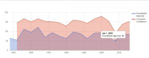
Time series data and analysis is typically used to extract hopefully meaningful connections or correlations between variables in the ways that they pool across time. In the continuous variable chart above, which plots presidential approval and consumer confidence ratings from 1948 to 2016, we can infer a few things fairly quickly that we may have struggled to read in the data alone: one, that there is consistent positive correlation (points move in same direction rather than opposite) between the two polls, and two, we can much more easily identify those years when polls suggested that presidential approval and consumer confidence were at their lowest, namely, in 1952, and in 2008.
From these visualizations, we can locate those datapoints that may offer a window into a deeper understanding of the data. In the case of the exceptionally low rates in confidence and approval of the incumbent president in years 1952 and 2008, we may want to dig for how during each of these years, the data supports or contradicts election voter polls, upholds or opposes ideological norms of the time, and potentially what similarities or interesting contrasts there may be between the two election periods.

Another useful way to look at the data could be through bar or categorical charts. In the chart above, I’ve filtered the categories down to unemployment and inflation, leaving the x-axis as “year”. In this kind of chart, we get fairly clear comparative visualizations, both for when the relationship of unemployment rates to inflation rate changed dramatically, and when and for how long the change was gradual. Such visualizations might shift our focus towards such dramatic increase or decrease as when 1980 hits and inflation drops heavily from higher to lower than unemployment, and employment rises from lower to higher than inflation.
Very nice! I especially appreciate that you posted two different visualizations, which allows us to compare and contrast the affordances of each mode.