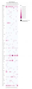
I created the adjacent data visualization on Adobe Illustrator using the dataset for my final group project: New York Philharmonic History Metadata. I’m focusing on creating data visualizations for the final project, so I used this assignment as an opportunity to experiment with the dataset. Just to get a scope of the entire dataset, the first concert date is December 7, 1842 and it ends on April 2, 1911. This visualization only depicts a snippet of the dataset, focusing on the first decade (a total of 10 seasons) from 1842-1852.
I focused on this shorter timeframe because it was more manageable for the assignment, yet was still enough material to see composer trends. I was interested in examining the popularity of the various composers. For each season, how many performed songs were composed by each composer?
In order to make the visualization, I cleaned up the GitHub spreadsheet by manually going through each row. I paid careful attention to the programID, workID, workTitle, and composerName columns. There were many rows that had repeating workIDs. In some cases it was because the same piece was included in two different programIDs. I kept these repetitions because they signified multiple performances of the same musical piece. In other cases, there were repetitions in order to incorporate more specific data in the other columns, such as movement, soloistName, soloistInstrument, and soloistRole. For the purposes of this visualization, I deleted these rows because it made it difficult to count the number of pieces performed by the composers, and I wasn’t interested in portraying data about the movements or soloists.
I used color saturation to indicate the number of performances. The more pink the color, the higher numbers of performances. The white overlay circles indicate that the corresponding composer had the highest number of performances that season (some composers are tied for highest number for each season). At a glance, the visualization communicates which composers are the most prominent each season. Observing these trends in the data was difficult to determine on the spreadsheet, but when visualized the trends become much clearer.
Really nice work, Anisa. I want to see a bigger version of this, though!
Definitely! I don’t why it kept shrinking when I embedded it into the blog. I’ll e-mail it to you!
I thought this was a really interesting way to visualize the information! While I too think the visualization is too small on this post, I thought that color saturation was a really cool way to portray the data and learn more about your data set. Great job!