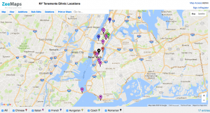
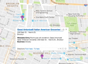
I chose to build a visualization of the New York Tenements dataset. I selected only a portion of the data to map, knowing that visualizing all of the data would have been a challenge. Using ZeeMaps, I depicted the restaurants, businesses, etc, that were clearly identified as a particular ethnicity. For example, “Gessi Antonicelli Italian American Groceries” was clearly indicated as catering to Italians in New York. I wanted to map this data to see if locations catering to certain ethnicities were clustered around the same area, potentially depicting that Italian Americans grouped together in one part of New York, while Chinese Americans grouped together in another. While the New York Tenements dataset is not comprehensive of all ethnic locations that existed in the city around the 1930s, it is a good starting point to see the distribution of ethnic tenement communities.
ZeeMaps provided a way for me to visually represent the geographical point of each location, as well as which ethnic locations were in the vicinity. The data itself would not have been able to convey this as well as a visualization. Nathan Yao’s principles, outlined in Data Points, discuss important aspects of data visualization. He asserts that visual cues work “because your brain is wired to find patterns, and you can switch back and forth between the visual and the numbers it represents”. Taking this idea of patterns into consideration, the main visual cue I used was position. With a clear position indicated for each location on the map, the data was much easier to understand. The viewer would not need to know where certain streets or Manhattan or Brooklyn were, or even how close they were in relation to each other. Instead, the viewer could just see all these things -and comprehend them much more quickly -on the visual map provided. The map would be a way to see the patterns, as Yao mentions, clearly.
The other visual cue I utilized in this interactive map was color. According to Yao, “differing colors used together usually indicates categorical data, where each color represents a group”. This is exactly how I chose to organize my data points: red, purple, blue, yellow, bright green, and black represented Chinese, Italian, French, Hungarian, Czech, and Romanian, respectively. This way, the viewer sees each color and easily understand where certain ethnicities tend to be clustered, as well as the number of locations there were for each ethnicity (based on this dataset). Although Yao mentioned the problem with red and green, and the potential colorblindness of many people, I chose to keep red and a bright green. There were already 6 colors being used, so it was difficult to find another very distinct color, as well as the fact that I thought the bright shade of the green may help differentiate it from the red.
Very cool! When we get to our mapping unit, you’ll no doubt be introduced to some tools (like SocialExplorer) that could help with this kind of analysis. Thanks for the introduction to ZeeMaps, too, which I hadn’t known about!
Great visualization! Very thorough step by step analysis and information for how you created your visualization. Thanks for introducing ZeeMaps, and I can’t wait for the mapping unit, since it allows the reader to visually locate problems in the city. I am not sure if your dataset initially provided the information on the ethnic enclaves, but I really appreciated this connection. This connection provides such an interesting narrative and can have a huge impact on the local community and policies.