Our group was assigned the Museum of Modern Art (MOMA) datasets. The two separate datasets contain records corresponding to pieces collected by the museum from 2006-2016, including the artists of those pieces (gender, ages, nationalities) and artworks (color composition, size).
I chose to work with the artists dataset. My group hasn’t begun data cleaning, so it was easier to work with the artists dataset, which was much smaller, had fewer complications (like empty cells, language issues, repetitions).
Being new to data visualization, I chose to keep my visualization small and simple:
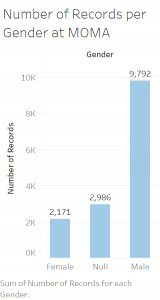
Using Tableau, I created this bar graph as a quick and simple way of visualizing the gender ratio of artists whose works are collected by the museum. The bar graph makes it clear that there are far more male artists featured than female.
I designed this bar graph with Nathan Yau’s principles of data visualization, as outlined in Data Points, in mind. Looking at the data in an excel spreadsheet, you cannot determine the disparity between male and female artists easily, for there’s just so much data to work with. If the point of a visualization is to communicate an idea that is not completely obvious in the dataset in a clear, simplistic way, I think my bar graph gets the job done.
The first principle I focused on was length. When comparing the two variables male and female (I’ll get to null later), a bar graph with a clear difference in length communicates the thought that female artists are not as highly represented in the collections as men. The lengths of the bars are fitting, with the male bar being a little under five times as large as the female, visualizing the data which shows that there are almost 5 times as many male artists as female (9,792 male vs. 2,171 female). I even included the actual values at the top of the bars to emphasize this point.
The second principle I focused on was direction. English speakers read left to right, thus I thought it was appropriate to orientate the graph in an increasing left-to-right manner. This aides the viewer and is an accurate way of representing the data.
The decision to leave in the “Null” data was difficult. Null represents artists for which their gender is unknown or left out of the dataset. When the data is cleaned for the final project, we might choose to leave it out, depending on what narrative we are trying to convey. On the one hand, leaving null distracts from the purpose of the visualization. However, to simply ignored this data in the visualization would not be an accurate representation of the dataset. Thus, I left the data in to remain true to the dataset.
Overall I’m proud of my data visualization and my first experience with Tableau. I realize it’s not very flashy, can easily be made using excel, and is not very complex. I think it visualizes the thought I am trying to convey, which is good enough for now. Going forward it would be interesting to view this data using different mediums. I think a pie chart could convey the same message, but I steered clear of a pie chart because of what Professor Posner mentioned in lecture (data viz people hate pie charts). It’d also be interesting to experiment with different color compositions, whether changing the color of each individual bar would aid the viewer or distract them from the overall message.
Like Professor Posner said, bar graphs are always great. I think that you did a great job at leaving the visualization in a simple format, that is easily read and understood by most, all while having it be effective and prove a point. (Great choice on using blue, a color that humans are very receptive to.) Also, I like the fact that you left the null in there to show that the gender was not known. This left me thinking that even though most were male artists, hypothetically speaking if all the null were women, the data divide between male and female could be a lot less than it is now. Either way, this visualization shows the true nature of your dataset.
Wow Connor, great walkthrough of your process. Also a very useful visualization of the data. I wonder if the disparity between male and female would be greater or smaller if we knew the gender for all of the missing artists?
Thanks Laurel! It’s definitely something we’ll have to investigate in our group.
My favorite part about this blog post is your incorporation of other topics we have covered in class–such as stating how choosing to leave out the null data will be left up to the narrative your group decides to take on. I also think your choice of using a bar graph was simple yet effective in communicating the obvious difference between male and female artist representation; it makes me wonder if the null set is mostly comprised of female artists who thought omitting their gender would be better for their artistic development.
Great job, Connor! I appreciate that you resisted to urge to add in flashy colors or other distractions. I’m excited that you made your first dataviz! Congrats! (Also, this reminds me of the old Guerrilla Girls poster!)
Thank you! It’s ironic that a museum founded by three women features so (relatively) few female artists *sighs*