Legacies of British Slave-ownership
Introduction: The DH project I looked at was the “Legacies of British Slave-ownership”. This project was conducted at the UCL (University College of London), 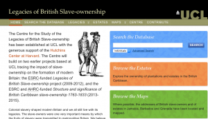 and one of the main goals of this project was to identify all slave-owners and estates in the British colonies after the mid-1700s; otherwise known as an “Encyclopedia of British Slave-Owners”. This project amassed and analyzed information about the activities, affiliations, and legacies of all British slave-owners on the database.
Sources: In order to create a massive encyclopedia of British slave-owners, this project had to pull information from many sources. They sourced the Slave Compensation Commission, which is a document that managed the distribution of the 20 million pound compensation and provided a census of slave-ownership in Britain in the 1830s. They also utilized different maps to locate the estates of slave-owners, such as OpenStreetMap, Digimap (for specific buildings), Lockie’s Topography of London, “Old to New Street Names”, and Aaron Arrowsmith’s map of 1807.
Processes: On the home page, there is a section which divides the information of British slave-owners into categories which aids your journey of identifying or finding slave-owners. The categories are: commercial, cultural, historical, imperial, physical, and political. T here is also a “Search the Database” and “Estates” tab at the top which allows one to advance search for an individual’s detail or a particular estate. Each category leads you to a different page filled with information and sorted based on the relevant title of the category. For example, the commercial legacy page is organized by name, position, and then location/business name. You can further click on “details” to see notes and sources. According to the lengths this team has gone to allow visitors to find individuals and estates, I believe this website is targeted more for scholars, researchers, and historians. The average person may not find such specific information necessary unless they possibly wanted to delve into their ancestors lives.
Presentations: Unlike the other DH projects, this one is not as interactive or visually appealing, which further adds to the case that this site is for more educational and research purposes. This project does utilizes maps, however, and you can choose to see either Britain, Jamaica, Barbados, or Grenada. For Jamaica, 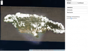 the map initially displays the location on a map in present time and then slowly fades to present a map produced by James Robertson in 1804 place over the current map. You can see in the image that there is an option to change the transparency of the map, and here I have the transparency set so you can see the current landscape with Robertson’s map slightly visible over the current one. The white circles represent estates of slave-owners, and you can click each circle to get more information about who owned the estate and a timeline of ownership.
Conclusion: Overall this DH project is slightly overwhelming with how much information is provided, and thus the team who created the website probably provided simple tabs and categories to make the excess information a lot less scary. The home page definitely makes the site look friendlier, and I am surprised how they could locate so many slave-owners around the world.
I agree that this website was definitely not as user friendly as some of the other DH projects we were told to examine. You did state that it might have been to give it a more educational/research type feel, but I still think they could have made it more user friendly regardless of who the intended audience would be. The screen shot that you included of the current day map fading to the 1804 map was definitely interesting to look at! When I was going through it I didn’t come across that. It might have been because I was quickly going through it though.
I admire that you tackled this project even though it was more difficult to navigate (I had a similar experience with Mapping Indigenous LA). It is helpful that you clearly identified the sources, processes, and presentations, and included multiple screenshots. You mention that the amount of information the project provides is overwhelming, even with the tabs and categories. I wonder if you think they should have included less information, or simply presented it in a different way? This makes me think that the processes and presentation style chosen for this project may not necessarily be best suited to the content it attempts to provide.
The way you analyzed the project’s visual and interactive aspects is very interesting! I had clicked on the website, saw how overwhelming the information looked, and promptly chose a different site to write my blog about. However, the way you described the relationship between this project’s target audience and it’s presentation makes a lot of sense! Your interpretation about this project being primarily for scholars and historians as opposed to average people is clearly supported by both the processes and display.
You made a throughout and incisive analysis on this seemingly less fancy and hardly interactive project. I am amazed by how you fairly evaluated the pros and cons of the site, meanwhile doing a lot of research on its sources and services. Without reading your post, I would never be able to appreciate the creative design on the multilayered maps. Totally agree with your opinion that this site caters to scholars/ students who have a clear objective instead of clueless viewers, and clearly the site can be more helpful and convenient if its developers can figure out better means of presenting the mass of information it stored. Congratulations for delivering great contents!