
The Photogrammer project is an online visual and organizational site used to view 170,000 photographs from the 1935-1946 U.S. period. These photographs were taken across the nation, documenting American life during the later Great Depression and through World War II. Developed by the U.S. federal government’s Farm Security Administration and Office of War Information, this photography project was designed to increase domestic support of government relief programs. Photogrammer includes an interactive map and archive, both of which utilize classifications tags that allow the viewer to search for specific photos within the expansive collection.
The primary source of data for the digital Photogrammer project is the FSA-OWI Collection. However, it also includes a number of photographs from the Domestic Operations Branch, Overseas Operations Branch, Office of Emergency Management- Office of War Information Collection, American at War Collection, and the Portrait of America Collection. On the “About” page, the Library of Congress is also thanked as a source for “maintaining and cataloging the collection”.
After finding sources for the photographs, the Photogrammer team had to process the data. One major organization process had already been completed by Paul Vanderbilt who developed the “Lot Number system and Classification Tags system”. This three-tier classification system categorizes photographs by subject (ex: “work”) , activity (ex: “social and personal activity”), area (ex: “The Land”), and more. More ways of categorization were added for this project, including date, specific location, and photographer. Besides this, the photographs had to be scanned in order to be viewed digitally. Also, detailed data on each photograph’s geographical location had to be computed to create the site’s interactive map.
Lastly, Photogrammer is mapped w/ Leaflet and CartoDB attribution. This interactive map plots geographical information of the photos. Users can customize their search by selecting a specific photographer, time period, and/or place. The points on the map can be viewed by county, which is the default, or by dots, which is specific to each artist and their location.
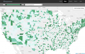
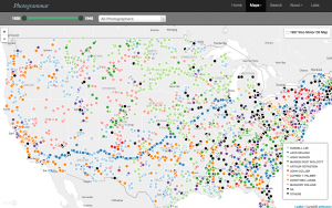
The county view gives a more holistic, overarching glimpse of number of photographs per location because the counties depict a larger area and specific artists are not taken into account. Meanwhile, the dots view is much more precise because each dot pinpoints the location of where each particular photographer captured their photographs. The lab visualizations include Treemap, Metadata Dashboard, and ColorSpace (which is coming soon). Treemap is an interactive depiction of Paul Vanderbilt’s 1942 tiered classification system. As the user clicks on each square, the photo search classifications become more and more specific. The interactive Metadata Dashboard of California uses a 1935-1946 timeline presentation, subject classification bar graph, photographer pie chart, and map of California as another means to search for and see connections between photographs. Finally, the Photogrammer blog, which gives extra insight into the process and thought behind the project, is powered by WordPress.
When I first viewed this database, I thought it was a little hard to understand because there is just so much information and so many data visualizations, but reading your blog has helped so much! I think you described it in an easy-to-follow way, as well as using the visuals to your advantage, as well as giving your opinion on which map suits the information better! World War II has always been an interest of mine and I’m definitely going to take a look at the archive and its photographs!
I really like how you broke down and explained the website clearly. Your blog post is very well organized and helps me understand the website without having to navigate through it myself. This post sparked my interest in the subject, and I will be sure to visit the website after reading your blog!
I initially was apprehensive to dive into this project because it seemed extremely nuanced. However, I think your blog post did a really great job at convincing me that despite the many levels of this interactive site, it is a very manageable site once broken down clearly. I would have liked to see a little bit more of a personal critique on what you liked or disliked about the site, but other than that… awesome post!