 Photogrammar takes the photographs collected by FSA-OWI from 1935-1945 and organizes the pictures by region, time and photographer to help give a better visualization of the state of the country during the Great Depression and World War II.
While there were 170,000 photographs in the FSA-OWI’s collection, also known as “The File,”– which is currently maintained and cataloged by the Library of Congress– Photogrammar only incorporated 90,000 of the photographs in their project.
The photographs were sent to the collection as negatives and from there the negatives were developed by FSA-OWI, Stryker and other sources. These developed photographs would have been scanned by the Photogrammar team in order to upload it to the web. The team then had to parse Paul Vanderbilt’s Lot Number System in order to get the accurate information about each photograph. By parsing the information, they were able to assign related tags to each picture (12 main tags and 1300 sub tags). They were also able to group the pictures in 3 main categories: by photographer, year, and location. The team expressed that although some of the identification were easy to make out, such as the photographer name, some identification, like the call number, was difficult to figure out. However, later on they discovered it signified the order of the photographs, allowing them to put the pictures back into its original strips. This was a breakthrough as it allowed people to follow the photographer’s point of view and allow the people to feel as if they were also going on the journey with the photographer.
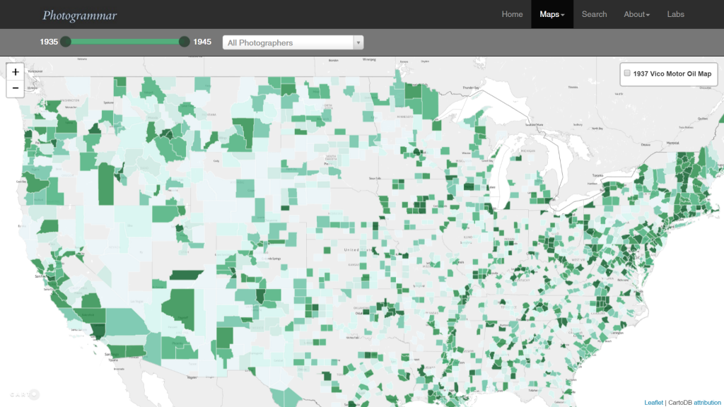
This project was created with the help of Vizzuality who incorporated Leaflet and CartoDB together. Aside from them, the main way the team presented these artifacts was by mapping them on an interactive US map. From the start, people are able to see which areas were more documented than the others. Then we are given the choice of narrowing down our options by filtering through the years or by the photographer. Filtering by photographers was especially interesting because it allowed the viewers to see where the photographer’s work was concentrated at or if they were on the move, it allowed us to get an instant view on how they traveled across the country. Once clicking on the location, we are then given list of small thumbnails that are related to our filtered search. This layout helps the viewers get a quick view on the state of the region that they are looking at. This in my opinion is a nicely designed interface as it allows the viewers to get an overall understanding without having to go through every picture, while still giving us the option to learn more about each picture by clicking on a specific one.
You did a great job of addressing sources, processes, and presentation for this digital project. Your post was very fluid as you moved from one level to the next which made reading it a nice experience. I liked how you included your own opinions about the interface and layout of the map. It would have also been really interesting to hear what argument you thought the creators were trying to make by organizing the photos using a map, as opposed to perhaps grouping photos by photographer or by subject matter. Overall, your post was awesome and it makes me want to go check out the project for myself!