Week 7: Network Analysis

The short story “Eight Trains” portrays the narrator’s encounters with people during the daily commute by trains. The essence of the story is encapsulated in a sentence from the story: “It’s (human reality) all pre-planned”. All people the narrator encounters are the unchanged elements within her life, rather than something “simulat[ing] the chaos of life”, as the narrator describes. Therefore, the people who appear in the story revolve around the narrator rather than interact randomly between each other.
screen-shot-2016-11-13-at-9-18-25-pmThe network graph of the people’s connections in the story embodies the statement perfectly. As one can see in the graph, all nodes represented as the people the narrator encounters in the story are connected only to the narrator in the center.
screen-shot-2016-11-13-at-9-19-09-pm

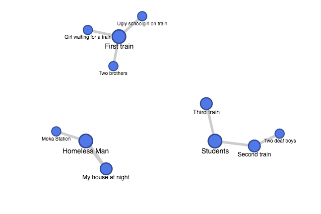
It is more interesting to draw the connections between the people and the places where the encounters take place. The nodes are then separated into three subsets. It is fascinating to notice that only the first half of the commute through eight trains are selected, possibly emphasizing the fact that the first half of the commute leaves a greater impression on the narrator. Also, the appearance of the “Homeless Man” as the central node corresponds to the significance of the character in the story, who appears both in the beginning and the end that marks the theme of the inflexibility of a repetitious life.

The network graph, however, does have its limit in that it cannot point out the significance of connections between the people and the narrator or between the people and the places. For example, one cannot tell what impacts certain characters have on the narrator’s life, or in what contexts certain characters appear in certain places. Such lack of dimensions prevents one who has not read the story from fully grasping the dynamics of the story.

Week 6: Locating London’s Past, the Map

Locating London’s Past creates a multi-layered map of London, with John Rocque’s 1746 map of London as the basis, and later 19th century and modern Google map as additional layers. The direct comparison of maps from different time is made possible by geo-referencing and indexing the place names in Rocque’s map.

screen-shot-2016-11-07-at-8-51-05-amAs I browse through the map and play around
with switching between the maps, Turnbull’s statement that “those who are imbued with what is sometimes called ‘the Western world view’ think of objects as having fixed characteristics and defined boundaries and as having a position specifiable by spatial co-ordinates” comes to my mind (Exhibit 1, page 2).

As suggested by its name, the essence of the map is to “locate” London’s past, by geocoding the places in the old map so that they are in the same modern spatial dimension. Therefore, spatiality is the central framework through which users can explore the linkage between the past and the present of London.

However, as Turnbull argues, maps are the mapmakers’ interpretative representations of the world. Such subjectivity is much more prevalent in the maps created in the time periods before the advent of modern technology. Therefore, spatiality, an interpretation of the world much central in the modern maps due to the accuracy of technology, cannot fully embody the interpretations of John Rocque and the mapmaker of the 19th century map.

One interesting comparison I can think of is to directly compare how the style of portraying the world through maps has changed throughout time and what might account for that change. For example, in Rocque’s 1746 map, many boats are drawn on the River Thames, but in the 19th century map, such emphasis disappears. What might explain this change in portraying the River Thames?

To fully demonstrate the comparison of the maps’ styles, a single map that layers the three maps together can be created. While the similarities between the maps can be deemphasized by fading them into the background, the differences can be highlighted, with explanations that elaborate on the cause of the changes, possibly due to a shift in  social or cultural norms. In this way, the map can locate London’s past within the shifting social or cultural perspectives of different time, rather than the fixed spatial perspective of the present.

Week 4: Data Visualization of Stock Market Indexes

The dataset I worked on is the statistics of the Dow-Jones and S&P 500 stock market indexes from 1991 to 2011 based on Yahoo! Finance’s historical stock quotations page. The stock market indexes have been widely used as an indicator of the growth of the economy or the stability of the financial market. As their data is often used by investors to determine the optimal time for investment, the following data visualization is created in accordance with the visualization principles listed in Data Points.

screen-shot-2016-10-23-at-10-00-31-pmThe Cartesian coordinate system, with time on the x-axis and the values of the two indexes on the y-axis, creates the framework of observing the fluctuations of the stock market throughout time. In this framework, investors can easily pinpoint the rising or the dropping points of the stock market and therefore induct the factors that caused the stock indexes to fluctuate. For the same reason, direction is used as the visual cue so that investors can easily see the boom or bust periods of the stock market from the slope of the plots. The context of the visualization can be easily clarified with the title “Stock Market Indexes from 1991 to 2011”.

It is interesting to note that the scales of the two stock market indexes differ. While the the values of the Dow-Jones Index range from 2,700 to 12,000, the counterparts of the S&P 500 are between 300 and 1,300. Therefore, it is important to use the log scale on the y-axis (increments by a factor of 10) so that the fluctuations within the two indexes can be relatively comparable on the same graph.

The visualized data shows an incredible parallel between the two stock market indexes as one can easily observe that the two lines follow the same trend of fluctuations throughout time. One cannot see the correlation clearly just by looking at the data itself without continuously punching numbers into a calculator. Therefore, visualizing data can have the advantage of demonstrating the correlation within data without one diving deep into it.

Week 3 Post: Ontology of Dataset

Wallack and Srinivasan argue in their paper that the divide between states’ and communities representations of ontologies can lead to information loss that silences the voices of individuals within the decisions made by states. An interesting comparison of two datasets from the L.A. Controller’s Office, shown as the top and the bottom result from the list of highest rated datasets, demonstrates how the differences between the most and the least valued datasets convey the presence of mismatched ontologies between the state and individuals.

The most highly rated dataset, “Balance of All City Funds”, provides 42 data types including the balance of the funds, the source of the funds etc. The record in this dataset is a specific city fund. The dataset on the opposite end of the spectrum, “Neighborhood Council Expenditures for Fiscal Year 2014”, provides only 8 data types like the name of the neighborhood council and the amount of the expenditure. The record in this dataset is a specific expenditure related to a neighborhood council.

Although both datasets can be defined as meta ontologies from Wallack and Srinivasan’s argument, as both are produced by the state of Los Angeles, the first dataset leans towards an inclusive meta ontology while the second dataset embodies a state meta ontology that “sheds much of the local context in order to ensure tractable management” (Wallack, Srinivasan, 2). “Balance of All City Funds” provides detailed information on the sources and purposes of the funds and how they are used eligibly. For example, row 17 and 18 record two funds with the purposes of “Zoo improvement projects” and “Animal shelter facilities” respectively. One can easily combine the two specific categories into one such as “Animal protection”, which is exactly what have been done in the second dataset. The task of each expenditure in “Neighborhood Council Expenditures for Fiscal Year 2014” is labeled with general attributes such as “Office” or “Event”.

The difference in intricacy of the two datasets may account for the difference in their ratings by individuals. Ones who interact with the second dataset can feel isolated from the actions of the state without knowing what exactly are happening behind the curtain, while those who browse through the first dataset can draw a detailed picture of the state’s decision-making. Although the first dataset does have data types like “Grant Receivable Asset”, everyone with or without a speciality in accounting or finance can grasp at least a piece of information from the dataset to understand the budgeting of the city, albeit to varying degrees. The second dataset, however, excludes anyone without the knowledge regarding the specific usage of each expenditure since it does not expose any detail.

I cannot think of any improvements over the ontology of the first dataset, but I see the ontology of the first dataset as a framework to which that of the second dataset should assimilate. From the perspective of an individual who would like know the details regarding an expenditure, if a contact information of the person in charge of the expenditure or the documents related to the expenditure are provided as in the first dataset, he or she can can gain access to the details even if not many numbers or descriptions are record directly in the dataset.

Week 2 Post: Narrative in the Finding Aid on Collection about Japanese American Internment

In his essay “The Value of Narrativity in the Representation of Reality”, Hayden White explores the central elements constituting a narrative. He states that a full narrative is achieved by “explicitly invoking the idea of a social system to serve as a fixed reference point by which the flow of ephemeral events can be endowed with specifically moral meaning” (White, 25). I would like to examine the contents of the finding aid on each “box” of collection about Japanese American internment, and argue that while the descriptions of certain box manifest certain traits within White’s judgement of a narrative, none can be defined as a full narrative.

Time reference can be found in each “box” of collections in the titles of the materials, but to a varying degree. Box 1 contains quarterly and semi-annual report on internment camps, and therefore lists the most accurate dates in chronological order, from “1942 October 1” to “1946 June 30”. Other 3 Boxes all have materials that are only labeled with year, and none of them is recorded chronologically. Therefore, only Box 1 exhibits the “flow of events” as described by White.

The characteristic of “a social system . . . as a fixed reference point” can also only be seen in Box 1. The reports on the internment camp build upon the framework of “general aspects of life in interment camps”, while the materials in other boxes describe a variety of social situations of Japanese internees.

Finally, “moral meaning” is implicated in the descriptions in Box 1. Words like “fears and anxieties” and “disturbance”, which suggest the fragile mental states of the internees and invoke readers’ sympathy for their circumstance, are implicitly taking a moral standpoint over the internment of Japanese Americans.

Based on the examination of connections between the descriptions of materials within the boxes of collections and the statement made by White, one may come to the conclusion that the descriptions in Box 1 constitute a complete narrative. However, one important element mentioned by White is missing. The descriptions in Box 1 do not “so much conclude as simply terminate” (White, 21). The description of the last material within the box simply states that the “report documents the end” of the agency that handled the interment of Japanese Americans, which implied the end of interment. However, the descriptions simple end without elaborating on the conclusions like the effects of the agency’s termination.

Therefore, the descriptions in Box 1 serves as an incomplete historical narrative that draws the general picture of the hardships of Japanese American internment but fails to wrap up as a story. An addition of conclusion such as the emotions of the internees or the social impacts of ending the internment can lead to the completion of the narrative.

Week 1 Post: Reverse Engineer “Inventing Abstraction”

screen-shot-2016-10-02-at-11-20-11-pm
Inventing Abstraction (1910-1925) is an accompanying website for the Museum of Modern Art’s exhibition “Inventing Abstraction, 1910-1925”. While the exhibition aims to bring together works across countries and genres during the early years of abstraction to demonstrate how the style has emerged and developed, the website expands the framework by focusing on the relationships between the abstract artists behind the works and how their creativities might be sparkled within the intertwining network of their personal connections.

Various sources build up the content of the website. First, diversified portfolios consisting of images of artistic works like paintings or sculptures, audio recording of poems, video extract of non-narrative dances, a few supplemented by audio guides that give additional commentaries on the works. While the audio guides are exclusively provided by Acoustiguide, a company creating interactive guide tours for museums or historical sites, the sources of the portfolios are from not only the Museum of Modern Art but also private collections, museums and institutions around the world. Besides the portfolios, texts that elaborate on the artists’ biographies are created by the team at the Museum of Modern Art, along with podcasts and videos that shed more light on other artists’ views of the exhibits and the inspiration behind the website project respectively.

The sources are then processed by the computer. Basic processes include digitization of photos, sounds, and videos under each artist’s portfolio. To construct the network between artists, their names are entered into an excel spreadsheet that marks whether a relationship exists between one and another. The data exported from the spreadsheet forms the basis of the network graph where people with more connections are differentiated from those with less, a characteristic underscored by further visualizations in design. The artists are tagged with geographical and personal markers including “year of birth and death”, “birthplace”, “places worked”, and “interests” that, along with the portfolio, make up a full artist profile. Their names are also catalogued in alphabetical orders. The whole data are then modeled based on the software created by Columbia University.

The interface of the website delivers an intuitive experience for the users. When one first enters the website, the home page introduces the early emergence of abstraction across different media, hinting at the idea conveyed later by the network graph that connections between artists of different fields lead to the development of abstraction. The button “Explore Connections” is placed in the lower right corner, a space arrangement that guides users to read the introductory texts in the middle first and thus equips users with the background knowledge to comprehend the significance of the network graph. The network graph is the heart of the website. The moment users leave the home page, they are taken to the page with the graph, with an “Overview” pane only automatically opened once that explains the logics behind the graph. The exploration of the network graph overall is a nonintrusive experience as buttons on the bottom navigation bar and on artists’ names on the network graph as nodes do not lead to separate webpages but the contents open side-by-side with the graph. Besides the UX design, the UI design also delivers an intuitive experience. The designers behind the project use Adobe Illustrator to construct the visual design of the contents. The color theme of “red”, “ivory” and “black” is used consistently throughout the design of the website and of the graph. “Red” marks only certain names within the artist catalogue and their corresponding nodes within the network graph to emphasize artists who have the most connections, or also the node of an artist that users click on, which then becomes the central node of his or her personal connections. The combination of UX and UI design therefore guides the users to understand the significance of the network structure behind the emergence of abstraction and how being in a network can foster creativity.