Blog Post 7: Network Analysis for “Pink”

This week I decided to read the short story “Pink” by Tomoyuki Hoshino. The story starts off by describing how Japan is suffering a severe heat wave. The main character Naomi starts spinning in circles when she sees fish in a park pond jumping in the air and spinning while suffering from the overbearingly hot water, believing the fish are trying to escape the “hell on Earth” . Later on, she takes her niece Pink to the park again and encounters a young man who tells them that many people have been spinning in circles clockwise as a sort of prayer to beat off the heat wave. As the story progresses, Naomi and Pink join a circle of spinners. At the end of the short story, somehow time has passed significantly fast and Naomi’s life goes to ruins. By the end, when Japan is suffering another heat wave, Naomi attempts to cool off her sister (Pink’s mother) while spinning counter clockwise and hopes to somehow travel back to take her life back and control it herself.

screen-shot-2016-11-13-at-9-19-01-pm

Network Graph
I decided to focus the connections on who were “spinners” in the story and who were never mentioned as spinning. The “spinning” part of the novel was significant, as it ultimately was the connection to how time sped so fas. With limited characters, the network analysis was not large and was not able to show how the “spinning” had an impact on the characters who did it. However, by knowing who were spinners in the story, the viewer gets an idea of why the spinning connection was important. To the young man, spinning was important as it was an escape from the cold reality he lived in, and him telling Naomi about the spinning group changed the course of the story. To Naomi, spinning was an escape from the current moment, not just from the extreme heat but from the unknowing path that life was taking her on. However, her decision to spin and bring Pink along into to it distorted time itself and both their life paths went downhill. The two non-spinners or “unknown” spinners of the story were Pink’s mom and dad. Pink’s father was barely mentioned in the story but Pink’s mother/Naomi’s sister was more significantly mentioned. By knowing that she was not a spinner, it somehow is understood that her time did not seem to move significantly fast, and rather that the disparities that she faced later in life were somehow due to Naomi and Pink’s spinning and distortion of time. The story is  difficult to fully grasp, but understanding that the spinning  and the characters directly involved in spinning were central to the story’s progression makes it easier to try and piece apart.

Week 6: reVilna Map

reVilna is a digital mapping project that focuses on how the residents of the Vilnius Ghetto lived during World War II. It uses over 200 sources from memoirs, archives, and documents and matches them to photographs to tell a story with an interactive map.

The map is divided into nine sections called “Stories”: Formation of Ghetto, Aktionen, Judenrat, Health and Education, Life in the Ghetto, Art and Culture, Resistance and the FPO, End of the Ghetto, and All Events and Places. The map uses a chronological storyline approach to navigate users through the various parts of the map. Users have to the choice to start from the beginning of the narrative and let the site navigate them throughout, or to explore the map on her/his own.

screen-shot-2016-11-06-at-9-02-34-pm

The map reveals a lot about the conditions of the Vilnius Ghetto and tries to show a more positive light about the unfortunate circumstance of being forced to live in the Ghetto by discussing the arts, culture, education, and health resources that was provided to the residents. While the map does discuss the positive aspects the Ghetto had, it inevitably is forced to discuss the formation and liquidation (moving the Jewish people to concentration camps) of the Ghetto which reinforces the situation to viewers about what it actually stood for: the mass discrimination and massacre against Jewish people. The map adds a different understanding to the narrative of Jewish lives in Ghettos during World War II. It adds some knowledge for people who would have never thought it was possible that Jewish people were allowed some type of “normal” aspects to their daily lives.

The creator of the map does a powerful in telling the story of how the Jewish people in the ghetto lived and functioned, despite the grave conditions they lived under, and discussing the drastically unfortunate end of the Ghetto. The project does a profound job at telling the story of the Ghetto; however, the map itself was not so significant as, besides knowing the location of the ghetto and placements of places within the ghetto,  there was no heavy geographical data. It seemed insignificant to have just have a map in the background when navigating through the narrative. Personally, I forgot that I was even looking at a map at all when going through each section of the project. I feel as though focusing more on a timeline visualization would have benefited this project more as it tells a story in a chronological order.

Week 4: Data Visualization for US Population Growth

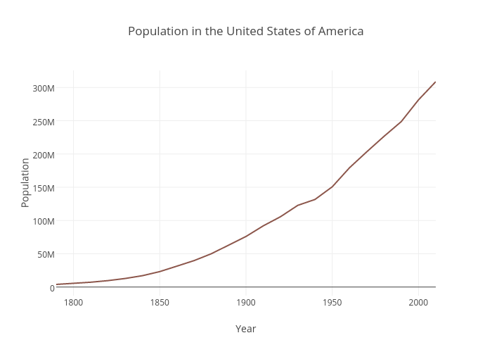
The data set I decided to explore was the U.S Population data set that shows the overall United States population from 1790-2010 in each decennial census.

The data set was very sparse, containing only two columns. One column was the year the census was obtained while the other column was the recorded population. Each record was the population of the US per a given year. Since the data was so simple, I decided to use a line graph to visually represent the trend of population growth in the United States. A line graph was the best option for this data set as it represents change in data over time (change in population as year increases). Both the variables were quantitative, continuos data which also made a line graph ideal as it shows continuos trends efficiently. The year was plotted on the x axis and the population was plotted on the y because the population is dependent on the year recorded. I used Plot.ly to create this graph as it was very straightforward and easy to embed in the post.

The important thing that the graph shows is the rapid population growth that starts after the 1800’s. While you can see the growth in population from the data set as well, the graph gives viewers a quick and more impactful perspective. The concave up shape of the graph signifies a major growth trend in a visual manner that the records do not easily convey. Not only does it show the rapid growth beginning from the 1800’s, but one can infer from the graph that the U.S population is just going to continue to grow, as the line continues to rise steadily. Further research about population growth can be done simply by looking at this graph. For example, one can look into the events that happened in the mid 1800’s that would have caused a spike in population growth (e.g the Industrial Revolution creating more resources for population growth). It is also easy to add data to the records every decennial year and continue the line chart to see if the population is still growing rapidly or leveling out. If one didn’t have the graph to look at, it would be more difficult to interpret trends from the data because it is not as straightforward and intuitive to the eye when purely looking at numbers. Graphs are highly efficient when working with and presenting large numbers because they are less strenuous to look at and catch the viewers attention faster.

Week 3: Payroll by Job Class

This week I decided to explore The Payroll by Job Class data set located at the LA Controller’s Office. The data set is a comprehensive collection of payroll information from Los Angeles City Departments dating back to 2013 to present.

The data is organized into 34 different categories including year, department title, payroll department, job class title, employment title, hourly/event rate, and projected annual salary. A record is constituted by a single individuals profile on his or her payroll information. However, individual names are not given and instead record numbers are assigned. There are 285,008 rows included in the data, and are arranged alphabetically by department title starting at 2016 and moving down in the same alphabetical order to 2013.

In Wallack and Srinivasan’s Local-Global: Reconciling Mismatched Ontologies in Development Information Systems, they state that a state ontology “sheds much of the local context in order to ensure tractable management for policy purposes including taxation, defense, provision of infrastructure and service, and economic management”(2). In short, because state officials manage the data, the information mainly exists for political reasons such as policy creations or revisions. A data set such as this Payroll collection is useful mainly for officials within the Los Angeles County, as they can have easy access to their employees’ salary information if they ever need it for taxation reasons, etc. The data set simply tells whoever is looking at it detailed numerical information about LA County job salaries.

What are left out from this data are specific details about the different jobs within the departments that account for wage differences. For example, in the Aging department, Senior Management Analyst 1 earns $53.46/ hr. while Senior Management Analyst 2 makes $66.23/hr. No differences between the two jobs are given besides one being called 1 and the other 2. Missing details like this make it unclear whether employees are being discriminated by being paid less for the same job or if there are actual differences between the two jobs that make one more difficult than the other, thus creating the wage difference.

If I were to write the ontology over with a non-government point of view, this data may then become useful for someone who is considering job within the county and would like to see how much he or she would be paid for said job. In a lot of cases, a major deciding factor for pursuing a career would be if the salary were high enough or not. This data set could easily help someone determine whether she wants to pursue a certain career or not or even give ideas for different careers based purely on the salary.

Week 2: Finding Aid for Sterilization Records

The finding aid for “Virgina Espino and Renee Tajima-Pena Collection of Sterilization Records” describes the physical records of court records from the Madrigal v. Quilligan lawsuit. The Madrigal v. Quilligan court case involved ten Latina women suing E.J Quilligan and his colleagues at the University of Southern California medical center for coercing the women to be sterilized in the mid to late 1970’s.

The archive is divided into two series with the first being court documents in the Madrigal v. Quilligan case. The second series consists of ten cassette tape interviews of multiple people including those involved in Latina rights movement during this time period, people involved in helping the women during the court case, and a resident at the hospital where and during the time the women were coerced into the sterilization. Based on the materials in this collection, readers are able to figure out the details of the court case narrative as well as get an understanding on how serious the case was for furthering fighting for Latina and minority women’s rights in the United States.

However, while the records help give readers a sense of the court case and the importance it had on the minority women rights movement, what the archive cannot provide to the narrative are the personal feelings of the women who were sterilized and how it had an impact on their future. The court documents give a technicality to these women’s’ cases, but not a full understanding of the long lasting psychological effects this forced medical procedure had on their well being. The records also cannot fully illustrate the prejudice in the mind of the doctors who sterilized these women. The court documents can display justifications the doctors used as excuses, but justifications are only the words the doctors want the public to hear. Through selective wording, the defendants and their lawyers were able to twist the case’s narrative in their favor, as the Latina women lost the case.

In order to remedy the missing information, interviewing the women or the women’s family involved in the cases would help readers understand the pain. In the finding aid, it was mentioned how the documents were used in the documentary No Más Bebés. With further research, I was able to find out that Renee Tajima-Pena not only used the documents to illustrate the court case and its effects on the Latina rights movement, she also interviewed some of the women in the court case and how it had an effect on their personal lives. However, even if someone were to interview the doctors, they could still deny they had any prejudice against the women and continue on with their narrative of the story. Thus, it is nearly impossible to fully illustrate this narrative, as it is so easy for these doctors to keep up their innocent image.

Reverse Engineer Project: Inventing Abstraction

Inventing Abstraction (1910-1925) is an online project hosted by the Museum of Modern Art promoting the exhibition of the same name as well as offering up viewers an additional insight into the vast amount of connections between the very first abstract artists. The exhibition ran from December 23, 2012 to April 15, 2013.

screen-shot-2016-10-02-at-8-55-07-pm

The website maps out connections of the early abstract artists featured in the exhibition such as Francis Picabia, Hans Arp, Pablo Picasso, Marcel Duchamp, and Georgia O’ Keefe. The map uses information from the artists shown in the exhibition and creates vectors between artists whose interactions had been documented during the time period of 1910-1925. The information was organized so that each individual artist has his or her own separate page when you click on the name. The page includes birthplace, places worked, interests, his or her art work(s) included in the exhibit, and, for certain artists, short biographical essays. The artists with the most connections during this time period are highlighted red to display their significance in the context of early abstract art.

Along with the interactive map, the website also offers up different tabs for viewers to gather additional insight on abstract art and the program. The top tabs include “Artists” “Conversations” and “Program and Events.” The “Artists” tab creates an alphabetical directory of the artists included in the map. The “Conversations” tab includes different artists discuss a painting featured in the exhibition. The “Program and Events” section directs the viewers to additional events held by the museum in conjunction or related to the Inventing Abstraction exhibition. The bottom tabs include an “About Exhibition” section where viewers have the opportunity to learn more about the showing as well as links to PDF copies of the interactive map and a checklist of the works featured. A “Publication” tab is included to promote a publication of the exhibition. The credits for both the museum exhibition as well as the website are also included in the bottom tabs.

The website was created by Second Story Interactive Studios and uses interactive technology to help viewer navigate their way through the map as well as 3D technology to make the map more interesting to the eye. Viewers are able to zoom in and out of the map easily with a zoom function in the corner. The website uses a simple theme of red, black, and cream colors to keep the focus on the content. All together, the website serves its primary function of displaying the connective map while offering additional information in a clear and concise manner.