For this weeks analysis, I decided to focus my efforts on analyzing the data set related to New York’s Museum of Modern Art (MoMA). This dataset included various aspects regarding MoMA’s artwork collection such as Title, Artist, Gender, Department, and Acquisition Year. These are only a handful of the many kinds of categories provided in the dataset.
In order to do some exploratory research I tried to utilize Tableau to generate some data visualizations to help guide further research progression on this dataset.
One visualization I examined was a comparison of Artist involvement within each department at MoMA as shown in Figure 1. In this visualization the departments are organized from largest in terms of artwork records on the outside decreasing as it goes inward for the overall circle. The individual circles represent the individual artists with size corresponding to how many artworks they’ve submitted for that department. The two biggest departments are shown to be Print & Illustrated Books and Photography with the largest contributors for each to be Louise Bourgeois and Eugene Atget respectively. The visualization helps showcase what are MoMA’s biggest departments in terms of artwork pieces as well as to show how condensed they might be to a few major artists.
Figure 1: Artist and Department Bubble Graph
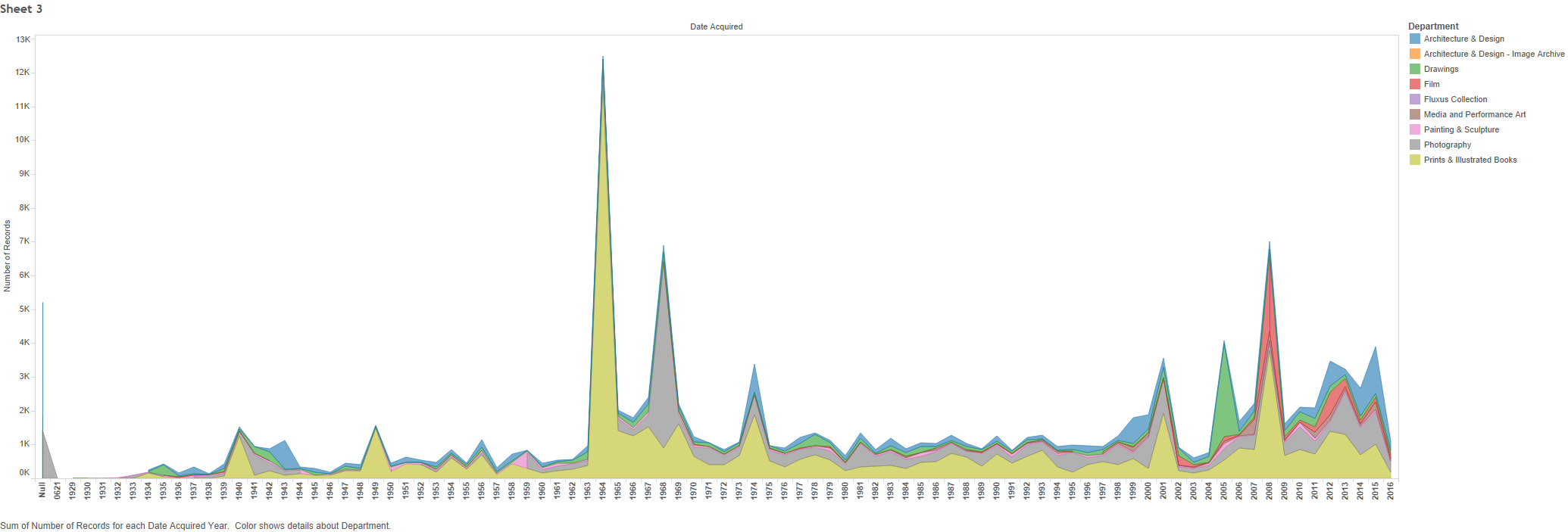
A second visualization that I analyzed was an analysis focused on charting out MoMA’s artwork acquisition dates on a time-plot as shown in Figure 2. The visualization overlays these acquisitions in terms of departments so it can then be shown which departments were most active in which periods. Looking at the chart, 1960-70 and 2008 stand out as major acquisition periods. The visualization helps showcase how wide a disparity these periods have in comparison to other years, something which would be much more difficult to quickly interpret from just looking at the raw data.
Hey, great blog post! I really liked how you provided two data visualizations for the audience to see two different types of perspectives! I can’t wait to see how this project develops!
Loved your visualizations! I think you made really good choices in relation to choosing types of visualizations for the data given. Your time plots and bubble graphs were great in pointing out specific trends I definitely wouldn’t have seen from just looking at the raw data.