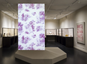
When I went to LACMA, there was a digital wallpaper projected on a wall on the third floor of the Hammer Building. Titled, “Shooting Wallpaper”, it was an animated film, with sound, looping every few minutes. It depicted a white and pink floral, country pattern with a young girl sitting in nature. Every so often, she would stand, walk towards the viewer, imitate shooting at the viewer’s direction several times with her hand (multiple gunshot sounds would be heard), and then sort of meander her way back to sit in her original position.
(Photos from LACMA Collections site)
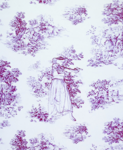
Since the digital display was so large, and made noise, a good number of visitors congregated around it to see what was happening. Most people stayed, watched it for a few minutes, and then carried on looking around the rest of the exhibition (which did not contain any other technology). Most of the kids that walked by were entranced by the screen, and called out to their parents to come and look. A few more curious viewers actually walked closer to the screen to read the description (photo included in this blog). There was also a piece of art that was similar to the pattern depicted in the digital wallpaper, on the right wall-side of the projection. Most viewers just walked passed this. I think because that art piece was similar, but not exactly the same as what was digitized in the projection, it was often ignored. Visitors probably didn’t realize that the two were meant to complement each other. While I was observing, I also noticed most people spent more time looking at visuals, art pieces, and artifacts, while using the text to supplement what they were seeing. Although this is slightly intuitive, it is interesting to note because it also explains what people will likely pay attention to when it comes to digital technology in museums.
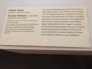
When I observed the “Shooting Wallpaper”, I watched it repeat several times. It was definitely an eye-catching, interesting piece. I personally felt that it was a bit out of place, though, because it was more attention-grabbing than informative. It also seemed a bit strange to put something using such modern technology in a room of older artifacts. I was actually more confused after watching it, than before. In this case, the museum’s use of technology was interesting, but I was not a huge fan of it. It just seemed difficult to connect the dots from a moving wallpaper back to the art that inspired it. Did the artist, Brigitte Zieger, just make one still of the art, and then it was animated in 2006? Where was the connection between the artists’ original intent and message, and how it was animated years later? None of these questions were really answered by the text cards, and left me feeling more confused by the use of technology.
(the other photos I took when I was there kept saying HTTP error when I tried to upload them, so I could only post the one I took of the text card)
I’ve spent time watching this, too! It’s mesmerizing.
This sounds like a really interesting piece of art. I wonder if the fact that it seemed so out of place was intentional? Maybe it was meant to be “disruptive” in order to make a comment about how disruptive technology can be in everyday life and how it can overshadow other important things (like how the animated piece overshadowed the normal piece). Just some food for thought!
That’s a really interesting juxtaposition of pieces. I often wonder how curators and designers approach these kinds of things, especially in terms of spatial limitations. I wish there was more transparency about how things are put together “Behind the Scenes” because it would be something to find out if it was intentional to display it as a kind of “Disruption” (like the above comment) or if it was a space issue…? This work reminded me of Kara Walker’s work with silhouettes (although her project speaks directly to regimes of racial terror). I think the piece itself is interesting, but I can also see its political limitations when thinking about this work and Walker’s. I didn’t know this was up though so thanks for the heads up! It is now on my to-do list!
I think it was definitely supposed to be eye catching and grabbing, given that it was in the middle of the room, but I too have many questions. I read the description in the picture you posted and was left fairly unsatisfied. I really would have liked more of the artist’s voice or perhaps more of her work to be shown in order to understand this individual piece. Thanks for sharing!
Screens clearly seem to be what attracts peoples attention the most in exhibitions – adding audio to the video makes it even more mesmerising. Do you think it would be less appealing if there was no audio involved? Since the audio can be heard throughout the room it’s hard to avoid concentrating on the main piece in the room. I think this was a clever decision by the artist to promote her own work.