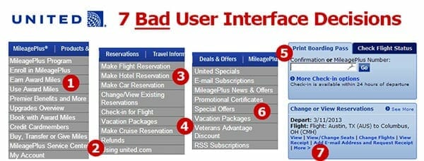
This is an example of a poorly designed user interface. A good interface is described “In the Elements of User Experience by Jesse James Garret”, where an interface design is compared to the process of making a story and as a story itself. “Strategy, scope, structure, skeleton, and surface” are all the layers of an interface. This is comparable to the fleshing out of a story. To take Garret’s comparison further, a book, the reader, and the writer are the three agents of engagement with a story. And the interactions of an interface’s design are among the product, the world, and the user. The design of an interface is shaped also by its technology. An example given by Garret is a magazine. The design of an interface for a magazine on a tablet will carry the same characteristics of an actual magazine. Therefore, the decision that the designer of an interface makes is based on the “objective of a product” and the “needs of an user”. Also, the content of the interface has requirements and “product specifications”. Like making a story, the author must decide the type of language suited for explaining information and foresee what the reader will already know. The structure of an interface tells how the user “makes sense” of the world. Therefore, a good interface is easy to use and understand.
The relationship between the user and how the user understands the world is mismatched in United’s user interface. According to rohitbhagarva.com, “the online Check-in for flights is increasingly one of the most common things that travelers are doing before heading to the airport”. However, the user interface of United only gives the user to print their boarding pass. This, according to rohitbhagarva.com, is confusing to people who might want to check-in, but not print their boarding pass. Also, there appears to be no structure to how the options are arranged. How the user makes sense of the world is again dismissed when the login is placed where it is hard to find, when it is usually the first option that a user would seek. The example of an interface for a magazine given by Garret follows what a person would expect of how a magazine would be read. United’s interface has a mismatch of how a traveler books a flight in person. The actual concerns of a traveler are misrepresented by the interface. Information, therefore, is misrepresented in United’s user interface.
Work Cited:
http://www.rohitbhargava.com/2013/03/14-lessons-from-the-best-and-worst-websites-in-the-travel-industry.html. image
Jesse James Garrett, Elements of User Experience. http://www.slideshare.net/openjournalism/elements-of-user-experience-by-jesse-james-garrett