
Ever since I can remember, local and national political election results have always been represented, in some way, through maps. It’s one of the more common ways media has been able to convey information to its viewers. Of course, the data represented in these maps can often be inaccurate, which is something we discussed in past lectures. Though I do not want to focus my post on this particular aspect, it’s just goes to show how powerful data visualizations used in media can easily reach the masses and relay incorrect information.
I definitely developed an interest in politics at an early age, and always watched election results on TV while at home. Now that the internet has become my generation’s more common way of accessing information, media outlets have shifted and included more of this access to election results online. The internet is how I now keep up with election results, simply because I don’t have a TV with me here at college.
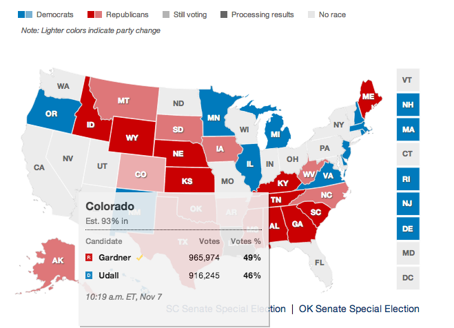
Maps, in my opinion, are one of the best visualizations for elections. I think it would be odd to show results without the classic outlined map of the United States with each state turning red or blue as results are confirmed. There’s some sort of novelty in that. Because I had work during the recent 2014 Midterm Elections, I went online to check results. From CNN to the LA Times, it seems like every news outlet used “maps” in some way or another to relay election results.
CNN.com

LAtimes.com
And I noticed something very important about these map visualization: the election map results I often saw on TV were also being included on websites, and in an even better way. It allowed me to access all the information (e.g. election result numbers) for the particular states or counties I cared about. Interactive continent maps allowed for the user to personalize his/her experience while using the map, versus a television with a reporter looking at specific areas that a viewer might not care about as much.
It’s very interesting to see how important web mapping has played in the history of politics and how it has affected how viewers expect to see results shown. For me, it’s just not right to not include a map visualization. There’s some part of me that enjoys seeing whether not this swing state will go red or blue this time. And honestly, it’s a little bit odd to think about elections in that way.
Sources:
https://www.e-education.psu.edu/geog863/book/export/html/1904
http://www.cnn.com/election/2014/results/race/senate
http://graphics.latimes.com/2014-election-supe-3-precincts-map/