What a Trip: Virtual Reality

In a virtual setting, fabricated renditions of what was, what is, or could be strikes me as odd.  How could one render a true experience, the time, the era, the social understandings of the culture and space of an area in the 21st century?  For the purposes of research and understanding the past, virtual realities seem to understand the complexities of its own creation.  A simulation could never capture the authenticity, live, in-the-moment experience; however, it does not deserve to be discounted. How could we truly know what it was like to walk in ancient Rome?  The scents, the energy–scientific or not–all of the feelings you experience in the moment do not truly translate.

Take a moment, as I have, to sit, think, imagine yourself in front of your computer—as we usually are—recreating ancient Greece and experiencing it from your screen; that is mind-boggling.  B.C. was an oral era.  What we know  from it stems from  surviving texts, images, artefacts that narrate the story of its past.  As I write this I freak myself out more and more so I will put it to stop that.  What a trip.

The research and articles published here at UCLA from Lisa M. Synder and Diane Favro illustrate beautifully the “challenges encountered harnessing digital technologies to investigate kinetic issues” (Favro).  I appreciated the articles more for the transparency and language employed.  The purpose of recreating a digital space in a different time, and environment, is extremely challenging, almost impossible.  Thanks to our advanced technology, passionate, intelligent scholars and  the ever changing and growing discipline, we are able to explore and inform spaces from the past to other generations.  They state the challenges and they “walk” us through their processes.  I found it compelling to hear their humility for the discipline and really respect the textual research already founded, which they build off of.  The article reminded me of our very own final project: documenting the process from beginning to end, evaluating data, tools, methodologies, our own limitations and expertise, scope, time, etc.  It was interesting to see how complex the founding of Digital Humanities was here at UCLA: “Two decades” (Favro).  Additionally, the evolution and how the discipline is tapping into new fields such as, 3D modeling, and incorporating multidisciplinary perspectives, more so than before.  The digital era we are a part of is quite unmatched.  It feels as if it is the best of times by really having access to ALL times.  Wow, that is weird.  What will be next?

3D modeling is completely foreign to me; I do not understand it, which is why these articles were challenging for me to really grasp.  I expect to learn a lot more at today’s walkthrough the virtual portal on campus.


Mapping Space and Time with Pics

4465635759_91f9e5320a_mBefore I endeavor to attempt to explain the connections I made this week, I want to take a moment and remember Mapquest: printed sheets with turn-by-turn directions B.G. (Before Google) and the proliferation of mobile-based navigation applications.  *sigh.
Per usual, I jump from site to site when doing my readings online or on an electronic device.  I always mean to disconnect from the internet but it never pans out.  One of the advantages, and disadvantages I suppose, is that I could explore sites that are referenced in the readings.  In doing so this week, I stumbled upon a site that suits this week’s theme and my team’s research topic: Phototrails.

Phototrails is committed to the exploration of “Cultural Analytics” which visualize patterns from Instagram photo uploads over space and time, which is what Ian Gregory mentions in his chapter, “Using Geographical Information Systems to Explore Space and Time in the Humanities.”  The large visual datasets aim to explain cultural rhythms and patterns in select cities such as, New York, Tokyo, Tel Aviv, over the course of three months.  What is neat are the relationships drawn from morning, afternoon, and evening uploads from 289 active users. (To aid this statement, please click here for the visual I am referring to.)  The utilization of advanced GIS Phototrails employs allows us to see operations in the Humanities continuing to narrate a story of scientific inquiry.  Furthermore, the results drawn from the rhythms and patterns invite further research on the social impacts social media, specifically photo based-apps, have on users.  Correct me if I am wrong, but isn’t this answer to Gregory’s question(s), rather the ones posed from critics in which he outlines.

When I read Gregory’s chapter, I was intrigued by two lines: “To date, however, this has proved highly problematic in the humanities.  A major reason for this is simply the complexity of handling large datasets that contain both a spatial and temporal component” (136).  Gregory highlights the challenges the Humanities encounter when integrating Geographic Information Systems into their academic research.  From what he mentions above, it seems as though Phototrails allays the “problem” with its work.  Furthermore, Gregory adds, “most studies in the Humanities focus on either time or space but rarely on both of them together” (140).  If I read his chapter correctly, which I might have missed the point, Gregory acknowledges the problems basic GIS software have when adopted by inquires from the Humanities. Additionally, he also recognizes the trajectory and interest in technologies paving the way for time and space working in concert with the Humanities.

Gregory concludes in what I call a bridge to Phototrails by foreshadowing the integration of time and space in GIS models.  It is as if they are speaking to one another across time and space.


Simple Stuff: A Network Analysis of Foodstuff Trade

A Network Analysis of Food Flows within the United States of America

Food is stuff.  By stuff I mean items we could quantify and classify with qualitative interpretations.  In theory, it sounds pretty easy to categorize them, monitor them, and then discuss them–through visual representations; however, it’s not so simple when you break things down.

In this vibrant, alluring visual above, you could see each state displays the relationships between foodstuff imported and exported in the United Sates.  It looks simple, yes, but if you look closely, you may get lost.  In an interesting article published in the Environmental and Science Journal, researchers explored the relationships between the 50 states when it comes to foodstuff commodities trade.  These relationships, referred to as “edges,” by Scott Weingart, allow us to conceptualize how food stuff moves from one to sate to another.  If you look at the states on the upper right heading clockwise, you will see states, such as Illinois, Louisiana, and California occupying the three largest areas.  According to the study, these states generate the most traffic-flow of foodstuff.  Additionally, if you compare Louisiana with Illinois, you will see a larger white/disconnected gap between Louisiana and the colors sprouting out.  What that indicates is the amount of imported commodities vs. exported.  While California has a well-balanced representation of imported and exported goods.  What does this mean and why does it matter?  Well, one way you could interpret this would be to say that the Midwest region, with the exception of California, plays a large role in our American food system dominating about 50% of the visual.  The Midwest is know to have vital landscapes and climate for favorable food production.  This could go into further, deep discussions ranging from politics, to history, economics and so forth.

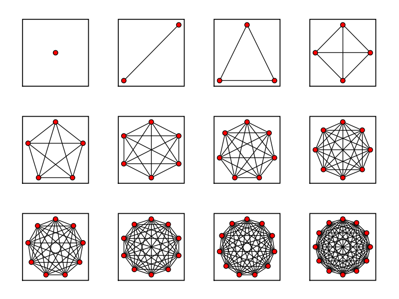
The “dense” network, what we see above,  illustrates  what Scott Weingart explains as “[a] network of nodes where almost everything is connected to everything… ” (Demystifying Networks).   Weingart describes nodes as stuff, generally speaking.  The nodes we see, or rather don’t see embedded in this visual, are food commodities categorized in the following manner: “cereal grains, other agricultural products, animal feed and products of animal origin, nec, meat, fish, seafood, and their preparations, and, other prepared foodstuffs and fats and oils” (A Network Analysis of Food Flows within the United States of America).  Vague categories, I know.  Nonetheless, all foodstuff fits nicely into all of those categories.  Weingart goes on to state that we  need to make our networks “sparse” to maximize efficiency, from a humanistic perspective.  The network analysis I provided in this week’s example is not necessarily humanistic, in fact, it’s scientific.  To say that this network analysis needs to be less edged is incorrect, nor do I wish to propel that argument.  Put simply, the data visualization I present is to give an example of a network analysis that displays complexity without “artificially cutting out” any edges.”  This goes back to past readings where we discussed the relationships between Humanities scholars and Science scholars in the digital humanities realm.

CAPT[A]VATING INTERPRETATION WITH A COVER

Credit: invisibleaustralians.org

Don’t judge a book by its cover.

This platitude resurfaces more and more with covers such as the one above.  The title of the “experimental browser” evokes a notion of  what if: “the real face of white australia.”  That is, what if the history of an established (super)nation were to be exposed and recreated with data mining and excavation from the past that tells a different story of its people?

I will return to the humanistic interpretation in a few, but first, I would like to discuss the visual displayed.  The visualization of peoples’ faces we see are a production employing a face detection script.  According to Tim Sherratt, the collection was compiled from a harvest of 7,000 photographs ready for the application to get to work.  Current applications such as, iPhoto and Google, perform, and simplify, photograph face detection scripts.  For Sherratt, the experiment of manually connecting the dots and displaying faces fascinated him for reasons other than just providing data in a quantitative manifestation: “you look at their faces and you simply want to know more. Who are they? What were their lives like?”

So what does the visual do for us at first glance?  It triggers a question: who are they?  And, what does Australia have to do with it?

Well, as we know, nations were once before inhabited by natives who do not necessarily look like the majority of natives now.  By showcasing the different face from what we are accustomed to seeing, we generate inquires about the nation’s past.  Judging from the website’s cover, we could see the ethnic diversity ranging from Indonesians, Philippines, Papua New Guinea, Asia proper, and other neighboring ethnicities.  These faces do not exemplify exclusive ties to one nation.  The faces are portraits of hybridity.  Which takes me to this next cover:

Credit: chandraprasad.com

The cover above came to mind as faces seemed to be dominate the space.  Chandra Prasad’s anthology showcases an array of fictional writers whom depict themes, characters, and notions of hybridity identification.  Works from one of my favorite authors, Ruth Ozeki, beautifully tells the story of a character who identifies as a being from two races: white and oriental.  Now, narratives aside, the covers of both images I put forth mirror one another, however, one is used as an instrumental tool incorporating data/capta, while the other employs the cover solely to highlight and trigger interpretation.  Like I mentioned before, the former cover still evokes inquires that relate to interpretation solely based on the surface of its cover.  Whether or not one cover is better than the other is not the basis of debate or inquiry.  Rather, the point is to further illuminate how both fields are working together, humanities and sciences, to further display visuals for different purposes, yet still produce similar ways of interpretations.

The Function(s) of Clothing

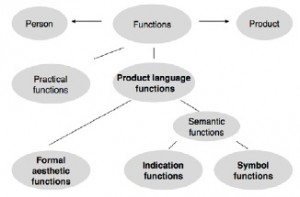
Product Theory Image


Since when did a coat become more than just a coat?  When scholars and researchers begin to unpack and explore fields of nascent inquiry, we are presented with information seen through a different lens.

The nexus described above highlights the distinctions of functions of an article of clothing.  The function of a product, such as a coat, is twofold, according to Dagmar Steffen, practical functions–for warmth, protection from rain, chemicals, etc–and product language functions–style, aesthetics, fashion statements, etc.  What Steffen explores and explains is the function of language and how we interpret  categories.  A coat falls under the broad category of clothing.  Under the ambiguous, yet somewhat specific category, we fall prey to losing traction as we know coats could also be categorized under particular seasonal lines: fall, winter, spring, and summer–nominal data.  Michael Castello clearly simplifies the ways in which data collection, databases, and visualizations are conceptualized and visualized.  The free online “guide” lays out the “how-tos” to the “ta-da, we’re done.”  What he explains with an analogy to a supermarket and food, is how we measure data with categories such as nominal, ordinal, interval, and ratio.  I mentioned nominal earlier when I said fashion lines by seasons.  The seasons are nominal data.

ch02-01-percent-basket


Similar to the grocery food categories, the coats under each season could be calculated as percentages and not averages to gives us a representation.

Lack of Wiring

Surveillance is omnipresent.  Unbeknownst to us, we are simultaneously observing, analyzing, and implementing hundreds, thousands of aggregated data/information.  Essentially, we are acting as surveillance cameras, through our eyes and ears; we decipher information pertinent to ours likes, needs, and wants on a daily basis.  We have heard the controversy surrounding our government agencies with this regard.  There is no need to regurgitate. However, it is important to note that surveillance is both good and bad.  Aggregation of information, metadata, is beneficial to scholars and other professionals for analysis and what to do with this a wealth of information.

Last week, UCLA received an $11 million dollar grant from the National Institutes of Health  to create a specialized group (center) that “would study biomedical data analysis,” says Amanda Schallert, Daily Bruin senior staff member.  The grant serves as a crucial aid for standardizing complex biomedical data.  It will employ researchers who garner data from other researchers in order to provide comprehensive and easy to understand information needed in this focused field.  To be frank, it all sounds incredibly complex to me just from reading ‘biomedical data’ (Schallert).  Nonetheless, UCLA is incredibly appreciative of this generous gift and aims to execute its agenda in the forthcoming years.

I would like to back track a bit to an article I read about data, Metadata.  At first, the title sounded intriguing, Understanding Metadata.  Sure, I’d like to understand metadata.  The conventional definition suits it right: data about data.  The article defined metadata clearly, and differently, along with other terms I had not been acquainted with: Interoperability, Dublin Core, The Text Encoding Initiative (TEI), and the list goes on.  These are all sub-terms under the umbrella of what constitutes metadata as a field of study.  I quickly saw my eyes glaring over and losing focus when terms upon terms rolled up on my screen.  What I noticed was that I was unable to process and digest this information.  I did not posses the tools necessary to absorb the information due to a lack of brain wiring/coding if you will.  Then, I made the connection.  The grant I mentioned earlier, the group focused on collecting biomedical data, is precisely what I lacked.  It will create the tools and equipment necessary to understand information.

‘Ah ha.’  That was the moment I connected the dots.  Naturally, it all made sense afterwards once I translated that experience to my life.

Daily Bruin:

http://dailybruin.com/2014/10/10/ucla-receives-11m-nih-grant-to-create-center-for-big-data-computing/

Understanding Metadata:

http://www.niso.org/publications/press/UnderstandingMetadata.pdf


http://dailybruin.com/2014/10/10/ucla-receives-11m-nih-grant-to-create-center-for-big-data-computing/