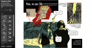
I explored the digital project, Totality for Kids, a project that aims to tell the story of communism in 1950s Paris, based on a book by McKenzie Wark. Designer Erik Loyer, the project uses the work of comic artist Kevin C. Pyle to illustrate and narrate the project. Totality for Kids narrates communism in post-war Paris by starting with post-war Paris “with the group’s predecessor the Lettrist International, and continuing through the apotheosis of political radicalism marked by the general strike of May ’68.” As the name suggests, the project uses an artistic quality that appeals to younger users, with an interactive interface the allows these users to directly engage with the artwork by clicking on the images and texts to read further into the project.
Navigating the site was really straightforward. The site is formatted almost like a Powerpoint presentation, with preview windows on the left with each page/slide marked with a number. Once clicking on a page/slide, the site transitions from slide to slide using animation. Each page uses the Pyle’s comic-like artwork as the central focus, with speech bubbles, maps, and text boxes being clickable for users to read into. The vocabulary used in these explanations reflect the sites goal of being “for kids.” Furthermore, key topics of each slide are presented next to symbolic images as to tie the visual with the verbal, further supporting this “kid-friendly” interface.
Since Pyle’s comic work is the central focus of the project, each slide is presented as if focusing on a single frame of a comic strip at a time, making the slides visually dependent on each other, and making the site, again, straightforward to navigate, as the slides are numerically marked.
I personally love the format of the site. I think it was really smart of the website’s designer to choose a specific demographic in order to drive their creative choices. The design aesthetic of the site is very clean, and I really appreciate making the artwork the central focus (again, because the demographic the site is trying to appeal to calls for it. ) I consider the site an overall success because of how seamless the narrative is due to the connection of the visual with the verbal, as well as successful in conveying the information in a way that is suitable for their intended audience.
Overall, I like that this project is unique in its aesthetic and voice. It’s really creative and shows that digital projects can be both informative and fun. The designers really thought out of the box for this project, and were really strategic in all of their visualization and presentation choices.