This week I was drawn to the book, Data and Design, by Trina Chiasson, Dyanna Gregory and many other contributors. I flipped through a lot of the pages of this book and was impressed not only by the helpful information that was presented, but also by the pleasing visual display. Immediately, I saw a lot of similar terms and ideas as I had seen in my Stats 10 book. I had just taken my first midterm for that class this week so all the different definitions of qualitative and quantitative data were fresh in my mind. I could personally attest to the premise of this book that data visualization and data in general can be overwhelming and confusing for “non-math” people. My brain is math oriented, but I had never taken a stats class before and I haven’t taken any sort of math class in over a year, so I was a little rusty. Both my stats book and Data and Design have helped me to see how certain types of graphs better display different types of data. For example, a pie chart is better for categorical data and a histogram is a more appropriate data visualization for numerical data.
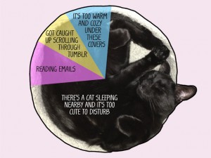
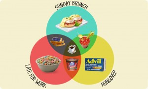
All this talk about graphs and data visualization reminded me of some of the fun Buzzfeed graphs I had come across when I was procrastinating one day. Typically, we think of graphs and charts as boring and inapplicable to daily life, but these graphs demonstrate that data visualization can be humorous also. My favorite set of graphs and charts from Buzzfeed is “12 Graphs and Charts that Perfectly Illustrate What It’s Liike Getting Ready in the Morning” by Adam Ellis, Buzzfeed Staff.
http://www.buzzfeed.com/adamellis/graphs-and-charts-that-perfectly-illustrate-what-its-like
These graphs depict information that we can all identify with and do it in a fun whimsical way. This article would not be as effective if it was just called “12 Things We Can All Relate To When Getting Ready In The Morning” and for #5 Types of Breakfast, Ellis just wrote there are different types of breakfasts depending on how the morning is going, but there is almost always coffee. These graphs take data visualization to a whole new level because they include actual pictures that make the data more appealing and memorable for the reader. Although, these graphs and charts do not have vital or completely accurate information, I think the authors of Data and Design would very much appreciate their design and creativity.

