
Written with Andy Wallace, with methods and ideas borrowed from Zoe Borovsky

If you’re reading this, you may know that topic modeling is a method for finding and tracing clusters of words (called “topics” in shorthand) in large bodies of texts. Topic modeling has achieved some popularity with digital humanities scholars, partly because it offers some meaningful improvements to simple word-frequency counts, and partly because of the arrival of some relatively easy-to-use tools for topic modeling.
MALLET, a package of Java code, is one of those tools. It’s not hard to run, but you do need to use the command line. For those who aren’t quite ready for that, there’s the Topic Modeling Tool, which implements MALLET in a graphical user interface (GUI), meaning you can plug files in and receive output without entering a line of code.
David Newman and Arun Balagopalan, who developed the TMT, have done us all a great service. But they may also have created a monster. The barrier for running the TMT is so low that it’s entirely possible to run a topic modeling test and produce results without having much idea what you’re doing or what the results mean.
So is it still worth doing? I think so. Playing with the results by altering variables and rerunning the test can be a useful way to get your head around what topic modeling is and isn’t. And, as I recently tried to convince my graduate DH class, screwing around with texts — even if you’re not totally sure what you’re doing — can be a surprisingly effective way of getting a new perspective on a body of work. Finally, seeing how many decisions need to be made about texts and variables is a great way to understand that topic modeling is not a way of revealing any objective “truth” about a text; instead, it’s a way of deriving a certain kind of meaning — which still needs to be interpreted and interrogated.
But in order to get any of these benefits from the Topic Modeling Tool, you need to be able to make some sense of your results, which is no easy task. The TMT generates some decidedly cryptic-looking files, and as far as I can tell, there aren’t many resources out there to help you make sense of them.
Once you survey the results of the Topic Modeling Tool, it becomes clear why topic modeling often goes hand-in-hand with visualization. The format of the results makes it difficult for a human being to discern patterns in them, and the files aren’t easy to visualize without doing some custom coding.
But say you’re a non-coder using the Topic Modeling Tool to screw around. You feed it some text, you get some files; now what?
What follows are some very basic ways you might begin looking at the results you’ve generated.
For the purposes of demonstration, I’ve used a set of 3,584 emails that constitute the years 2008–2012 of the Humanist listserv. We originally downloaded the emails here and then divided each volume into individual emails. You can find the dataset I used here, and the files that comprise my TMT results here.
For further reading (and viewing) on topic modeling, I’ve listed my favorite resources here. For more on the Topic Modeling Tool in particular, I recommend this summary and video of a talk by David Newman, along with the accompanying slides (PDF).
What are these files?

When you feed a body of text to the TMT, you get two folders: output_csv and output_html.
CSV stands for comma-separated values. The documents inside your output_csv folder are spreadsheet documents that usually open in something like Excel. HTML documents will open in a web browser.
You have three CSV spreadsheets:
- DocsinTopics.csv, which provides you a list of topics and shows you which documents they’re likely to appear in;
- Topics_Words.csv, which offers you a numbered list of “topics”; and
- TopicsinDocs.csv, which provides a list of documents, along with the topics that appear most prominently in each.
You have one main HTML document, called all_topics.html. As we’ll see, this offers a numbered list of topics, along with a way of drilling down into each topic’s associated documents. Also inside your output_html folder are a folder called Docs, which contains an HTML page for each document; a folder called Topics, which provides an HTML page for each topic you’ve generated; and a document called malletgui.css, which provides your web browser with some instructions for displaying each HTML page.
Start with TopicsinDocs

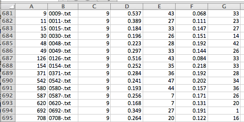
I find it useful to start with the TopicinDocs.csv file. But the file requires a bit of explanation. For one thing, it’s helpful to know that each row is meant to be read across.
- In the image here, Column A gives each document a number.
- Column B provides that document’s filename. (We’ll make that easier to read in the next step.)
- Column C tells you which topic (from a separate numbered list, which we’ll find in a different document) is represented most prominently in that particular document.
- Column D tells you what contribution that topic makes to the document in question. For example, for document 1, we can see that Topic 9 makes a contribution of 0.384 —or 38.4% — to the document’s contents.
- Column E provides the next-most prominent topic in the document (in this case number 27).
- Column F tells you what contribution that topic makes to the document’s contents.
- Column G provides the next-most prominent topic …
… and so on.
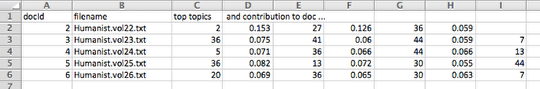
Make filenames easier to read

Your spreadsheet is trying to be helpful by providing you with the entire path to each document in Column B; that is, by showing you how to navigate to each document. But that’s hard to read. I find it helpful to get rid of most of the path information — in this case /Users/miriamposner/Dropbox/UCLA/DH 201/Topic Modeling/Datasets/Humanist emails 2008-20012/By individual email/ — by selecting Column B and using Excel’s Find and Replace function (in the Edit menu) to get rid of every occurrence of that path.
Once you do this, you should be left with just the filename of each document, which is much easier to read.
Get a sense of what each row means by making a pie chart.

The kind of topic modeling that we’re doing assumes that every document contains multiple topics. That’s why each row lists multiple topics for each document. To get our heads around this, let’s make a simple pie chart. Copy a row from your document — I’ll choose Row 2 — and paste it into a new Excel sheet.
Now you need to reformat this data a little bit so that Excel can make it into a pie chart. Delete the first two columns, which provide the document number and filename. Then, make one column called Topic and one column called Contribution. Put each topic in the Topic column, and put each topic’s contribution right next to it, in the Contribution column.
The Contribution values may not add up to 1 (meaning 100%), because the TMT is only showing you those contributions beyond a certain threshold. So in the last row, create a topic called Other. For its contribution, type in this function: =1-SUM(B2:B4). (Replace B2 and B4 with the first and last cell numbers of each of your contributions.)
Once you’ve got a grid that looks similar to the one above, highlight the cell values, and from Excel’s Charts menu, select Pie. Now you have a visual representation of the contribution of each topic to the document.
I can’t do this for each of my documents, because I have more than 3,000 of them. But now I have a better understanding of what each row is telling me.
But what are these topics? (1)

Now we sort of understand that each topic contains multiple topics in different proportions. But what do the numbered topics refer to?
That information is contained in a different document, and this next step requires a lot of toggling back and forth between our TopicsinDocs.csv file and our all_topics.html file.
Start by double-clicking all_topics.html. It should open in a web browser. You’ve got a list of topics (or, more properly, word clusters).
It’s important to realize that these topics are listed in no particular order. But the number of each topic corresponds to the topic’s number in your TopicsinDocs.csv spreadsheet. It’s also important to realize that there are more words in this topic than we’re being shown. By default the Topic Modeling Tool just shows us the top 10 words associated with each topic.
So the topic modeling algorithm thinks these are meaningful. We have to figure out why.
In the document we were looking at in the previous step, we saw that Topic 9 made the most prominent contribution. So I’ll click on that topic — here, it’s uk ac london kcl www king http college research centre — and see what it’s all about.
But what are these topics? (2)

When we click on an individual topic, we get a webpage that shows us another way of looking at it: a list telling us which documents feature that particular document most prominently. Here, we see that the file called 3276.txt contains the most words associated with this particular topic.
But what are these topics? (3)
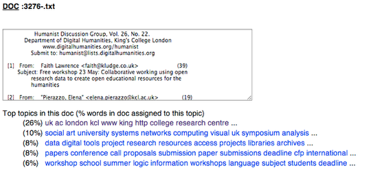
We know that we’re interested in Topic 9, and we know that it’s featured most prominently in this list of documents. Now we can try to start figuring out what it refers to. We might start by just taking a guess. I have a basic familiarity with the corpus in question, and my hunch is that this word cluster is associated with King’s College London, and particularly its research activity. To confirm my hunch, I’ll drill down into the top-ranked documents in our Topic list, as shown in the image above.
Unfortunately, my data doesn’t tell me which words are associated with which topic, but by surveying a number of documents, I should be able to either confirm or question my hunch.
Name your topics

I find that it’s a useful exercise to try to name the topics in my list. Doing so requires me to alternate between reading individual documents and looking for patterns, and it’s an interesting way to look for clusters of meaning that surprise or confuse me. When a topic doesn’t make sense to me, it’s a good excuse to investigate!
If I’m able to name my topics, I’ll have a quick-and-dirty concordance of sorts to the Humanist emails.
By now it should be abundantly clear that no part of this process is “scientific”; it’s just one way of getting your head around a large body of text. So there’s no right or wrong topic name, just schemas that do and don’t help you find interesting features of the text you’re looking at.
Look for patterns
Topic modeling is generally very useful for, say, learning about change over time. And if you’re running the TMT on a small enough set of documents, you might be able to glean that information from your spreadsheet. But if you, like me, have a bunch of documents, it’s quite a bit harder for a human being to suss out patterns without visualization tools.
But you can try. Using Excel’s Sort and Filter functions, you can, for example, show only those documents for which Topic 9 makes the greatest contribution. You can look for documents that seem to have a similar distribution of topics. It’s challenging, but it’s worth doing, if only to get a better sense of how topic modeling works.
Alter variables and try again
The results of any topic modeling test will change a great deal depending on some important decisions that you make. For one thing, the way you divide up documents makes a big difference to your results. In the preceding example, I chose to divide the Humanist emails into 3,584 separate documents. So the TMT is determining topics by looking for clusters in each individual email.
But instead of thousands of individual emails, I could have chosen to feed the TMT five separate chunks of emails, one chunk per year. In that case, the TMT would look for the clusters of words that characterize each year of emails. The image above is my TopicsinDocs spreadsheet for this scenario. You can see that it’s easier to discern gross patterns, but I lose a lot of the nuance I got in the preceding example. And why should a year be the interval at stake here? Might there be a more meaningful way to divide time — perhaps a series of events that I think might be watershed moments for DH? But then again, would that division just tend to confirm my bias?
In the scenario I described here, I chose to ask the TMT for 50 topics. But I could have chosen to ask for fewer, which would tend to make each topic more broad, or more, which would tend to make each topic more specific.
Which set of variables is best? I’m not sure. It depends on what interests you. For me at the moment, what’s “best” is trying multiple strategies, comparing them to each other, and making a list of things that surprise or confuse me.
26 responses to “Very basic strategies for interpreting results from the Topic Modeling Tool”
[…] to horrify. Then after Zoe Borovsky’s in class demo and Miriam Posner’s excellent tutorial, I finally understood what I was looking at and how I could accomplish the same feat…which by […]
[…] Also I would choose a topic that I was more familiar with to get better topic descriptions. Without Miriam’s strategies, I would have been completely lost. Thank you for posting this. phew. Share […]
[…] Projects ← Very basic strategies for interpreting results from the Topic Modeling Tool […]
[…] it through a tool which groups words across the corpus into ‘topics’. Miriam Posner has described topic modeling as ” a method for finding and tracing clusters of words (called “topics” in shorthand) in […]
[…] Two interesting posts by @miriamkp @benmschmidt sappingattention.blogspot.com/2012/11/when-y… miriamposner.com/blog/?p=1335 This entry was posted in Uncategorized by LaDale Winling. Bookmark the […]
[…] and run it through a tool which groups words across the corpus into ‘topics’. Miriam Posner has described topic modeling as “a method for finding and tracing clusters of words (called “topics” in shorthand) in […]
[…] David Mimno, The Details: Training and Validating Big Models on Big Data Miriam Posner, Very basic strategies for interpreting results from the Topic Modeling Tool Lisa Rhody, Topic Modeling and Figurative Language Ted Underwood, What kinds of “topics” does […]
[…] Very basic strategies for interpreting results from the Topic Modeling Tool […]
[…] Another software that is quite popular for topic modelling in DH is the Topic Modelling Tool (TMT), and its use and examples are described by Miriam on her DH blog. […]
Came back here after all this time to note that TMT is for Latin character sets only, and only for unaccented Latin at that. Without careful testing (or picking into the code), my guess is that it’s just for ASCII, but that might be more restrictive than it actually is.
Oh, and there’s an open question in the TMT repo at Google about this: https://code.google.com/p/topic-modeling-tool/issues/detail?id=3
[…] run it through a tool which groups words across the corpus into ‘topics’. Miriam Posner has described topic modeling as “a method for finding and tracing clusters of words (called “topics” in shorthand) in […]
[…] http://miriamposner.com/blog/very-basic-strategies-for-interpreting-results-from-the-topic-modeling-… […]
[…] and the list he provided is still comprehensive, as far as I can tell.1 My current favorite is from Miriam Posner and Andy Wallace, which emphasizes the practical side of topic modeling — it’s great for boostrapping if […]
[…] Modeling Made Just Simple Enough (simple enough but no simpler); Miriam Posner and Andy Wallace, Very Basic Strategies for Interpreting Results from the Topic Modeling Tool (practical approaches for quick bootstrapping); Scott Weingart, Topic Modeling and Network Analysis […]
[…] Posner has written a great blog about how to interpret the results from Topic Modelling […]
[…] modeling has been defined by Miriam Posner as a method for finding and tracing clusters of words (topics) in large bodies of texts. One […]
[…] deemed important to address before Congress, what would I end up with in terms of topics using Miriam Posner’s techniques for developing and interpreting one’s own topics in the field of digital humanities? The answer, as I have already said, was unexpected and served […]
[…] or even underwhelming. That is where we can begin some exercises in good topic analysis. Miram Posner offers a few good starting points when it comes to topic modeling such as naming each topics, […]
[…] must clearly understand what is Topic Modeling. UCLA’s DH Professor Miriam Posner’s Blog site http://miriamposner.com/blog/very-basic-strategies-for-interpreting-results-from-the-topic-modeling-… is a great source to read about Topic Modeling and how to interpret your data sets once you’ve […]
@Trip Kirkpatrick
If you’re interested (even though this comment comes two years later), I’ve forked TMT to allow for UTF-8 characters. It also generates UTF-8 HTML and CSV files, and has by default a RegEx option that allows for accented characters and diacritics. It’s available on GitHub, source and compiled version (in the “target” folder).
Link: https://github.com/ulbstic/topic-modeling-tool-FR/
[…] [1] http://miriamposner.com/blog/?p=1335 […]
[…] an introduction to analyzing topic models, see Miriam Posner’s blog post. For those familiar with, or willing to learn, R, see how to run MALLET from within R and view the […]
[…] Posner, M. 2012. “Very Basic Strategies for Interpreting Results from the Topic Modeling Tool”, blog entry, available at: http://miriamposner.com/blog/very-basic-strategies-for-interpreting-results-from-the-topic modeling-…. […]
[…] Read “Very basic strategies for interpreting results form the Topic Modeling Tool” by Miriam … […]
[…] Read “Very basic strategies for interpreting results form the Topic Modeling Tool” by Miriam … […]